
In the world of graphic design, typography plays a fundamental role in conveying messages and capturing attention. More than just an aesthetic choice, it influences visual perception, emotion, and the visual identity of your creations. When properly mastered, typography helps strengthen the message and improve the visual impact of your projects. In this article, we will explore how to choose the right typography and use it to structure your information effectively, while taking into account current trends in graphic design.
These elements, when well combined, help create a harmonious and professional structure.
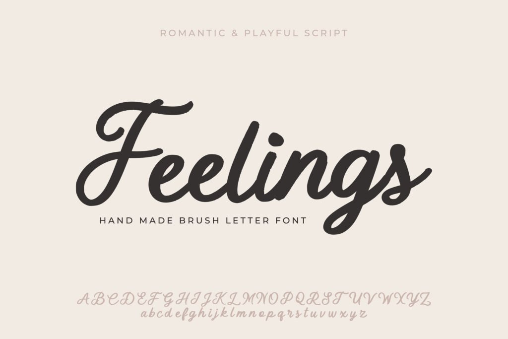
Each typeface has the power to convey emotion. For example, a handwritten font can add a personal and warm touch, while a modern sans-serif font often conveys a sense of professionalism and clarity. When choosing a font for your project, it is essential to consider not only its aesthetic but also the emotion it evokes. For instance, for a creative project aimed at children, a playful font like Comic Sans may be appropriate, whereas a business report might favor a more formal font like Times New Roman.
Read our guide on the impact of fonts on emotions in graphic design
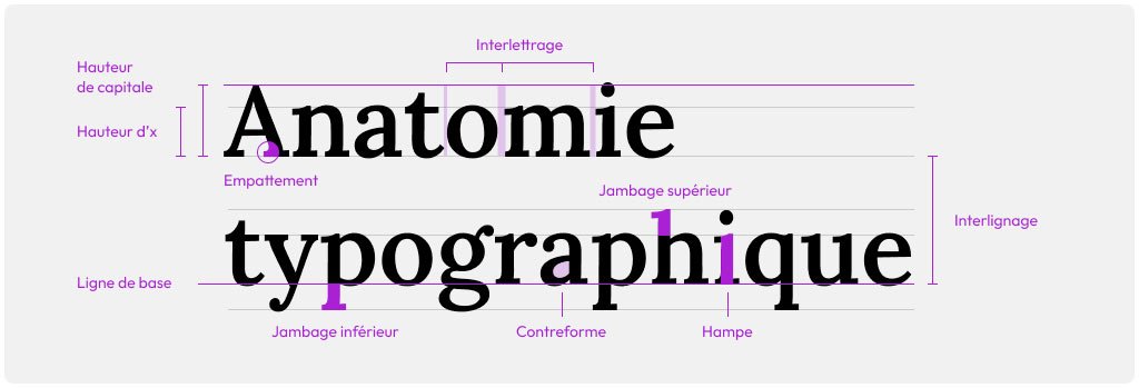
Good typography improves not only aesthetics but also readability and accessibility. For example, text with a font that is too small, low color contrast, or insufficient spacing can quickly become unreadable for your readers, especially on digital devices. Using sufficiently large, well-contrasted fonts and properly spacing lines and characters is essential to provide a smooth and pleasant user experience.
A well-structured typographic hierarchy is essential to guide readers through your content. By varying font sizes for titles, subtitles, and body text, you allow readers to quickly identify key information and navigate your creation more easily. For example, an H1 might be 36 points, while H2 could be 24 points, and the body text 12 points. This creates a natural visual flow that makes reading easier.
It is also important to choose fonts that complement each other well for headings and body text. A common combination is to use a serif font for headings and a sans-serif font for body text, or vice versa.
Typographic contrast is another powerful tool to attract attention and enhance the visual impact of text. It involves alternating styles such as bold, italics, or uppercase to differentiate certain parts of the text and highlight them. For example, you can use bold headings and italic subheadings to create a visual rhythm. Be sure that these contrasts do not become too harsh or inconsistent, as this may reduce readability.
An effective typographic contrast helps visually segment the content while maintaining overall harmony in the design.
Minimalism continues to be a dominant trend in graphic design. This is reflected in the use of modern typefaces, often sans-serif, that are clean and easy to read. Fonts such as Helvetica and Arial provide a professional and contemporary look that pairs well with minimalist designs. This style is particularly popular in user interfaces (UI) and web design, where clarity and simplicity are essential.
Modern typography focuses on readability and delivering a direct message, with minimal visual clutter.
Another popular trend is combining multiple typefaces within the same design. The idea is to create a subtle contrast between fonts while maintaining overall harmony. However, it’s important not to exceed two or three different typefaces, as this can make the design visually cluttered. For example, you can pair a handwritten font with a sans-serif font to add a creative touch while still ensuring readability.
To successfully achieve this type of combination, prioritize typefaces that share similar characteristics in terms of weight, letter height, or style. This creates visual balance while clearly differentiating the sections of your content.
Typography is a key element of a brand’s visual identity. By choosing a typeface that aligns with your brand’s personality and values, you can strengthen your brand image and make it instantly recognizable. For example, the typeface used by Coca-Cola is inseparable from its branding and contributes to its iconic visual identity.
When developing your branding, make sure to choose a typeface that reflects the tone and style of your brand. A traditional and formal look might opt for a serif font, while a modern technology brand will likely prefer a clean and elegant sans-serif typeface.
Certain brands have become famous thanks to the use of iconic typefaces. Beyond Coca-Cola, companies like Google and Apple Inc. have also adopted unique typographies for their logos and visual communications. For example, Google chose a modern sans-serif typeface to symbolize simplicity and accessibility, while Apple uses a refined and elegant typography to reflect its premium and innovative style.
These typographic choices reflect the values and messages that brands aim to convey. They also contribute to the consistency of their visual identity across all media, whether online, on packaging, or in advertising.
One of the most common mistakes in typography is not choosing fonts that are appropriate for your audience. For example, using a decorative or overly complex typeface for a professional report can undermine the document’s credibility. Similarly, a very formal font for a website aimed at children may fail to capture their attention.
It is therefore essential to clearly understand your target audience before selecting a typeface. Ask yourself: what emotion and atmosphere do you want to convey with your text? Once this is defined, you can choose a font that aligns with your objectives.
Discover how to choose the right fonts based on your audience

Excessive creativity can sometimes harm the readability of a project. Using too many different styles (bold, italics, uppercase, etc.) within the same design can quickly become confusing for the eye. The goal is to achieve a balance between aesthetics and clarity. A simple and consistent typographic hierarchy will make your design more effective.
Limiting the number of styles to two or three within a single design helps avoid visual overload and ensures smooth readability. The moderate use of contrast and style variations enhances visual impact while maintaining overall harmony.
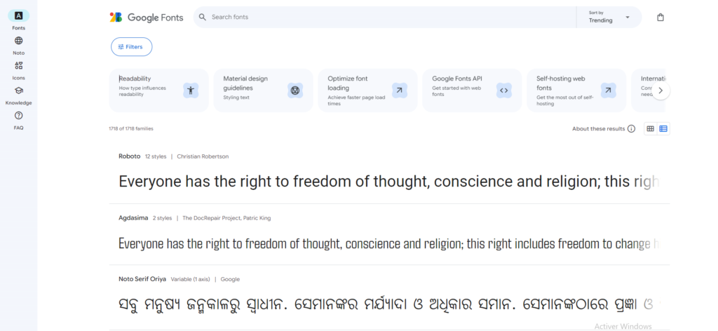
When it comes to **graphic design** for the web, choosing the right fonts is essential to ensure a pleasant user experience. Fonts available via Google Fonts are widely used due to their free access, variety, and browser compatibility. Fonts such as Roboto, Open Sans, and Lato are popular examples that combine readability with a modern style.
In addition to Google Fonts, there are other services that offer high-quality web fonts, such as Adobe Fonts and Font Squirrel. Choosing the right font for the web involves not only considering aesthetics but also performance in terms of loading speed and adaptability across different devices.
One of the challenges of graphic design on the web is maintaining fast loading times while using custom fonts. Each additional font you load on your site can slow down its loading speed, which may impact user experience and SEO. To avoid this, limit the number of fonts and their variants (bold, italic, etc.) used on your website.
By compressing font files, using lightweight formats like WOFF2, and loading fonts asynchronously, you can minimize their impact on site performance. This ensures a good user experience while maintaining a visually appealing design.
Typography is much more than a simple aesthetic choice in graphic design. It directly influences user perception and can strengthen or weaken the visual impact of your creations. By choosing the right fonts and applying principles of visual hierarchy, readability, and consistency, you can transform your projects and communicate your messages more effectively.
Whether you are working on a branding campaign, a web design, or an advertising poster, mastering typography will help you maximize the effectiveness of your design. By avoiding common mistakes and staying up to date with current trends, you can create work that is both impactful and professional.
To learn more, check out our complete guide on typography in graphic design
Share it
MonDesign Web, your digital marketing agency, dedicated to guiding you to the pinnacle of your online success.
We use cookies to improve your experience on our site. By using our site, you consent to cookies.
Websites store cookies to enhance functionality and personalise your experience. You can manage your preferences, but blocking some cookies may impact site performance and services.
Essential cookies enable basic functions and are necessary for the proper function of the website.
These cookies are needed for adding comments on this website.
Statistics cookies collect information anonymously. This information helps us understand how visitors use our website.
Google Analytics is a powerful tool that tracks and analyzes website traffic for informed marketing decisions.
Service URL: policies.google.com
Marketing cookies are used to follow visitors to websites. The intention is to show ads that are relevant and engaging to the individual user.
Facebook Pixel is a web analytics service that tracks and reports website traffic.
Service URL: www.facebook.com